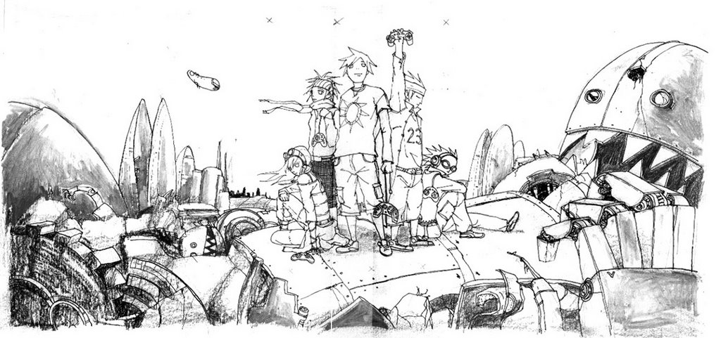
This is an illustration for a world cyber games article in MDA's annual report for Epigram. Here's the step by step. Pencils on 305x458 paper. Penned with g-nib pen to get a little line width. Added rough pencils and charcoal at certain spots to get that rough rust/dirt texture. Tried opaque white marker to smudge some pencil parts to get a different dirt texture. This was an experiment that went ok. whew.

Scanned and used painter oils and acrylic brushes to paint on another layer. Added sky from a photograph. Added smoke over top layer. Adjusted colours on both line and colour layers using photoshop.


13 comments:
Steam!!!!
I like the guy with the game pad!!
How many pieces u illustrate? I havnt seen it.
You know how much i love this piece lah!
(sigh...)Nice work...will look really if it get print as a giant poster.Great work A!
very nice!!
lovely!!!
GOOD PIECE, andrew. but i feel maybe you can try another way of styling the female character eyes. inject more of your style to them. just a suggestion. dun angry hor.
Thank you all. I put the two other pieces that are decent in my other blog. Ya i have a bigger poster of it but with no where ideal to hang it. You are right Andy (bonus points!), was thinking the same thing. Eyes can be better. But i didnt change them after i drew over in pen.
i personally prefer the pencil sketch. Felt the colors in the colored version looked "muddy" ..and the guy holding the console with the hand lifted..i felt the pose looked stiff..somehow the form is lost..dun really like the characters , but i love the environment..esp the evil looking robot by the side..and that little "finger" looking spaceship hovering in the background.
i like the mood and feel.
Hey cool. Thanks Sei-ji for the honest comments. They are appreciated. More comments like these are helpful. Yes i agree, that figure looks stiff. And the characters can be a lot cooler. Good ar, can't hide these weaknesses from you guys. It challenges me to do better for the next piece. Thanks!
i like the colour, the styling of your robot! but the styling of your human feature can be more sophisticated. ('u')
i agree with sokkuan, the background is spot on and beautiful, but the characters lack a little Oomph.
it could be improved with more detail and realism to the chracters
Still an overall great illustration though!
I think this piece is not meant to be real but stylised in a "naive" dark way somewhat. The lack of absolute realism and being a little "unfinished" is its charm. :)
it's steam punk meets final fantasy!!!
Post a Comment