Wednesday, November 29, 2006

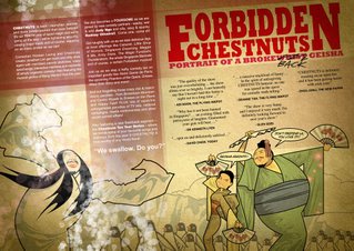
Portrait of a Brokeback Geisha


A doodle in photoshop done out of boredom, and some pixel art...meant for mobile games..and in case anyone is interested, pixel art for mobile games have to done, using as limited a color palette as possible, for technical constraints

Tuesday, November 28, 2006

chilling hungry


chilling hungry
Originally uploaded by white dog bobby.
something i painted awhile back... its now at swirl a dress boutique at stamford house. maybe one day someone might buy it along with a pretty flock.

Shop at maad


Shop at maad
Originally uploaded by white dog bobby.
buy something you have never bought before for xmas!

HALLO!


I'm Twisstii, and have been lurking under the rocks and secretly checking out OIC for some time. It's very nice to have a blog for all illustrators to unite as one and give generous comments to each other's work. I am still an amateur to all this, and am glad to be part of the club :D
another of of my "baka" picture.. just something done in in photoshop.

Hairstyles


Something i did for 141 Singapore with Guan. Fun!

Sunday, November 26, 2006

SCRIBBLES AND SPLATTER


Seems like I'm the only illustrator who's free this time of the year...(skips around empty blog room)
So I decided to post some of my old sketches from my sketchbook.
All sketches were done with ball point pen. Notice the bunny sticker? I was trying out my black opaque marker, and the darn thing leaked onto the area, and so I decided to cover that spot up by using my white opaque paint marker (hmm.. how smart!).

And guess what? The white paint got splattered all over because I shook the marker too hard. (somehow this sound familiar, I think it actually happened to one OIC member) So, yes, it became worse, and in case of emergency, I whipped out my trusty DIY sticker and taa-daah! Problem solved! (well..kind of)

So yes, if you can give some comments (the good, the bad, and the ugly hahaha) I'll really appreciate them. Be brutal if you have to....(shudder)

Wednesday, November 22, 2006

"i miss you"


i figured that the loneliest guy
in the world would be an astronaut.
he has just visited planet "paddle-pop"
thus the color of his astronaut costume...
besides it looks almost like a slightly more cheerful
prison outfit u noe, black and white stripes...
like he's imprisoned in space.

dedicated to all the people we miss.

Tuesday, November 21, 2006

stages


thumbnails to finished image, cover for wonderland issue 4 :p

tr mmmm..just exploring around ..and the octopus and lady was inspired by a famous "porn painting"(the japanese called them 春画) , except the japanese painter did it much more graphic and with absolute skill.

Monday, November 20, 2006

pins vs pink

hello everybody!
my name is pins and i'm very excited to be here
amongst the many great artists and illustrators.
this is my first post and i've decided to show
a step by step thingy of how i do things.
urmmm this is not really a tutorial but
jus a sharing of ideas and techniques.

first of i start with a sketch.
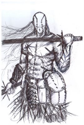


then i throw in a simple bkgrd color and start to "painting with photoshopping."
the sketch is on a separate bkgrd with multiply as the setting.
i've never used pink in my work before so i've decided to give it a try...


now i paint over the layer of the sketch to cover up my messy lines haha
i've been told by many great artists to keep my lines clean
but to their dismay and horror i jus find it difficult to do so.
i like tidiness but when it comes to drawing i'm very messy...
i mus change...
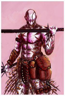


i told myself ... "hey the john abruzzi hair has got to go..."
so goodbye long hair to mr pink warrior guy bye bye and hair no more...
the power of photoshopping.
now i need to enhance the bkgrd with a tint of blue.
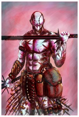


almost there but mr itchy fingers pins have decided to add some little highlights
and lines to define the outline??? urmmm a small difference but hope you can see
hehe...
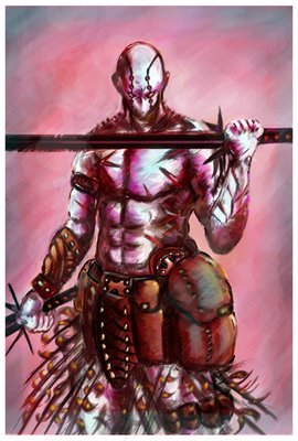


and it's almost done and i've decided to stop because the more
i stare at it the more mistakes i see...
so good bye for now or i'll never stop painting this dude...
work can never be finished...

i'll look forward to beer and future encounters with members of O.I.C...
need to go home and watch prison break!!!
wait... it's monday!!!
'DOH!

Saturday, November 18, 2006

CHILDHOOD SERIES #2


click on image above to view enlarged details

Image: top row second left: the pink dots represent the light source that i indicate on my artwork before i start painting in photoshop

Right after Childhood #1, immediately proceed to #2 for the on going series . The illustration took way too long to complete, because this time i decided to try using the tablet instead. This piece to be honest was 40% on wacom tablet and the rest was done by using the traditional mouse "technique". Still couldn't get the hang on that piece of technology(d'oh!), but i'm not giving up yet! I post this piece as a step by step "tutorial" so to let you guys have a clearer picture how the artwork reached its final stages. This series illustration hope to bring out a little bit of nostalgia and a little bit of innocence in my work, in another words; Happy Thoughts!
Fellow illustrators your comments are most appreciated! (bows)


Childhood Series #2
23 x 15 cm pencil on bristol paper.
Colour in Photoshop CS

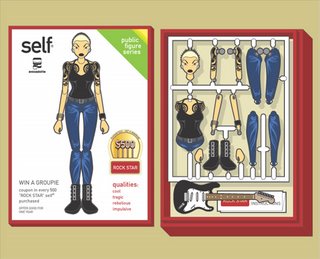
Self


Kuanth's Playmates series kinda reminds me of this illustration series I did for the Human? book by Fontmonster a while back. They had some publishing issues, so the book isn't out yet.

The idea for "Self" is about stereotypes of styles. As humans, everyone has the perfect "Self" image in mind. Wouldn't it be great if you could just buy one that you like and use (or flaunt) it instantly? Perhaps even mix and match different "Self"s to satisfy your need -- if you've got enough $$. This one is the Rockstar "Self". There's a Policeman, Pop Diva, Soccer Mom, Dot Com Yuppie, and Swimsuit Model "Self". All based on loosely translated stereotypes found in NYC.

Friday, November 17, 2006


This animated short is beautiful and strange and chilling and highly worth a watch. Check it out here:

http://motionographer.com/media/idol.mov

should we do an online exhibition here?

2007 is around the corner, why not we go and select 1 piece of our work that we love the most within 2006 ,and do an online exhibition here. how does that sound?

Children's Cancer Foundation


something i did last year with the guys at Leo Burnett. Jon, Vic and David

just some dolls that i made!

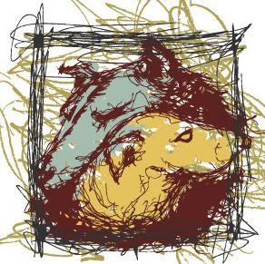
HairY & PassionatE (HYPE)

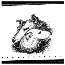
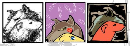
An illustration i did for HYPE titled 'HairY and PassionatE' (i can;t remember if it's 2004 or 2005), inspired by a poem about a love story between a dog and a wolf, which i wrote prior.

it started with a pen sketch.
Photobucket - Video and Image Hosting

then indecisive me toyed with different styles.
Photobucket - Video and Image Hosting

couldn't get past the original rough sketchy effect, i decided to explore that route. so i developed borders and more strokes.
Photobucket - Video and Image Hosting

and ended with this.
Photobucket - Video and Image Hosting

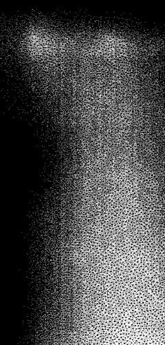
then i played with the photocopier. i copied a gradient print out over and over, playing with the contrast and ended with this effect.
Photobucket - Video and Image Hosting

after another round of composition, this is the final drawing.
Photobucket - Video and Image Hosting

cheers!

Thursday, November 16, 2006

Wacom promo at Sitex

Hi fellow ink and paint abusers- just heard that there will be some special promos of Wacom products at Sitex 30Nov- 3rd Dec. So wait a while if you have not got it yet.

Sophie Black

kuanth, here she is to beat your playmates!!! hehe...

Winter


watercolour and ink

Wednesday, November 15, 2006

Drewscape's Rhodia12


(It's his first time in an exhibition)

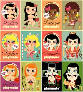
for adults only!

they are here to serve your wildest fantasy!!playmates, anyone? haha...i did it a few years back, always wish to find a toy company that willing to produce them into real dolls, something like Blythe. anyone knows any toy maker?

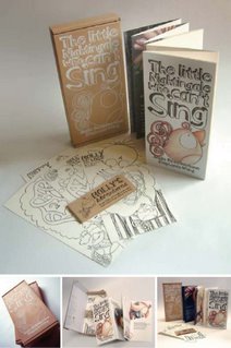
Holly, The Little Nightingale


Steff says Hello..
Holly the little nightingale "Rings"
Check her out at MPH, Borders, Times, Basheer, Pluck (at Haji Lane)

Sponsered by MDA's "First time writers & illustrators publishing Initiative Grant"

p/s: feels great to be part of the blog."To drawing we DEVOTE" :)


Killer
'Killing me softly'
My works are based on my own journal. This is wat i felt at the moment.I practice my expressions in visual and writings.
Its here on SeekGlory and SpeakGlory. Feel free to browse through,k. Cheers, have a blast!!

WACOM SIAO!

urban legend


cheers yo ppl...my 1st post here and my 1st artwork since my mishap
enjoy.

osare...quick sketches in photoshop of tokyo wear

Vengeance is mine!


i absolutely love this movie.

I think in grey tones


Help! I think I'm becoming an Ashley Wood wannabe!!!! Arrgghh :p

Dream dream dream


Ok i finally am posting something! This was for stabilo's launch at taka tunnel using the new colour markers pt 68 and pt 88. The theme was 'color your dreams'. i drew the outlines and carol my gf helped me with colouring it....it was kinda cool to see her strange colour sense but the end result was pretty zany.

the new HPB poster!

anyone see this in the hawker center? sokkuan and i created it, we both like the characters but too bad, the design... a bit sucks.:P

my latest work created for elle

sokkuan! now we are ENEMY! i created all these for elle horoscope!!! hahahahahah! my elle v.s your herworld!!!!

just a girl from my sketches