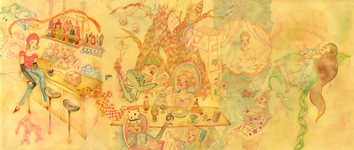
Watercolor + color pencil, A3, for an ad promoting House @ 8DDempsey Rd....(client: Spa Esprit) The spread can be found in L'Officiel Singapore, October ed. They divided it into three small pics, so you wouldn't see it in this panoramic form.

link to bigger pic: here
Another thing: I have a little exhibition as part of House's monthly 'adopt-an-artist' program. It's been running over a month, but you can still visit it until Dec 15th.


4 comments:
very nice! i particularly like the middle scene, the colors are warm and inviting but some details are lost in the yellowish background. just curious, why was it done in panoramic form? as the three/four scenes seem pretty distinct to me.
Hi ag,
the direction was to make separate scenes of the spa, club, and restaurant ( 'House', 'Barrack', and 'Camp') that flows when merged together. The very right part, however, was digitally stitched after the whole thing's done because they wanted more focus on the spa section.
The details can be viewed via the link I gave in the post. It would lead to a bigger view in my Flickr page where the details are bigger & clearer. I want to put the big size pic, but am afraid it would ruin the blog's layout. :)
i really like ur style!
and how u drew the tree trunk. :) lovely!
to cel:
thank you! :)
Post a Comment