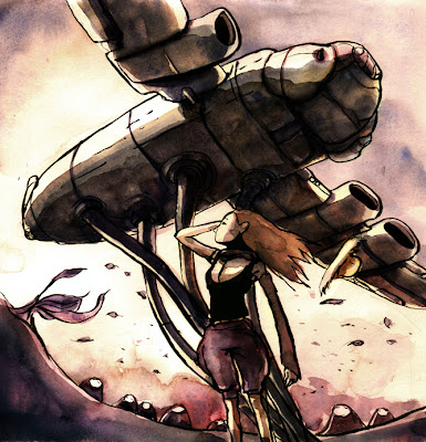
Ink/brush and watercolour. Colours and tones enhanced in photoshop.

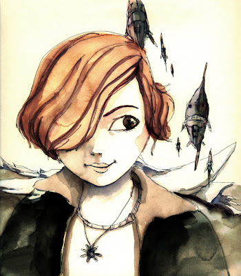
Pilot G-tec-c4 pen and watercolour. Colours and tones enhanced in photoshop.
These drawings are part of my study on how to use tones to make a scene work better. Tones as in (if you convert everything to greyscale) light, mid and dark shades. By strategically placing the tones, you can make the objects that you want stand out from each other. eg. a person in a dark suit will stand out better against a ligher toned background. I noticed Jon Foster pays much attention to this in his drawings to much success. Here's a quote from his book "I was taught that if a work wasn't successful in black and white, color would only make it worse. Values come first; details and color later." This is where i've gotten so far. Let's hear some insights from you guys.


4 comments:
good study! this reminds me of my lecturer's taught. learn to judge your work from thumbnail, to plan and study if it works better. And too bad i was too slow to understand that. i have a better idea whats value is now, only after working for years... reading books,and a couple tutorial dvd...ha ha...slow bee me...!
your work is really improving very fast. it got me surprised, especially lately... now i know wat it is... toning! wow...i learn something today. thanks for the sharing!
I luv these washes!!!! And the values of course!!
thanks. and thanks to flee for the cool reference art books.
Post a Comment